What Defines the Flat Lay Style
The best flat lay jewelry photography ideas share one thing: restraint. Flat lay is shot from directly overhead — a 90-degree top-down angle — with the jewelry lying flat on a surface. That's the whole mechanical definition. What separates a flat lay that stops a scroll from one that looks like a phone photo on a kitchen counter is far more specific.
The first thing that matters is the surface-to-metal match. Gold and rose gold warm the eye, so they want surfaces that absorb rather than compete: unbleached linen, warm sand, aged oak boards, or blush textured paper. Silver and white gold are cool-toned and high-contrast — they read sharper against cool neutrals like slate, pale grey marble, or white seamless. Platinum works on almost anything but earns its sharpest edge on brushed concrete. Put a silver pavé band on warm linen and you'll spend an hour in post trying to correct a colour cast the camera locked in at capture.
Negative space is the second defining hallmark. Most beginners fill the frame. The flat lay style that converts on Etsy and Pinterest keeps 60–70% of the composition empty. The piece needs room to breathe. If you're shooting a 14k gold chain on white foamcore, the chain itself should occupy maybe a third of the frame — the rest is the surface doing its job.
Lighting for flat lay is almost always soft and directional, not overhead. A large diffused window at a 45-degree angle to the surface is the standard starting point. A 60×90cm softbox at the same angle replicates that indoors. Avoid placing a light directly above — it flattens the texture of the surface and kills any sense of dimensionality in the piece itself.
Finally, flat lay has a styling logic. Props are props, not decoration. A sprig of dried eucalyptus next to a ring isn't there to look nice — it's there to frame the ring and give the eye a path to follow. If a prop is competing with the piece for attention, it's the wrong prop.
When to Use the Flat Lay Style
Flat lay is not a universal solution. It works extremely well in certain contexts and badly in others.
It's the right call for your Etsy hero image. Etsy crops the first image to a square in search results. A flat lay on a clean surface frames the piece clearly in that square crop without the awkward head-and-shoulders framing problem that hits lifestyle shots. A solitaire engagement ring shot flat on white seamless at f/11 reads perfectly at 200×200 pixels. The same ring on a hand crops to a thumb.
Flat lay is also the format wholesale buyers expect. When you're building a linesheet for Faire or putting together a lookbook for retail buyers, they need to see the piece clearly against a neutral background. They're evaluating the construction, not the story. A styled flat lay on slate or white card stock is the right language for that audience.
On Instagram, flat lay content performs differently by account. For accounts with a strong editorial identity — a consistent surface, consistent negative space, consistent props — flat lays build a feed that looks intentional. For accounts that mix lifestyle and packshot, the flat lay often ends up looking clinical. Know your grid before you commit to a shooting style.
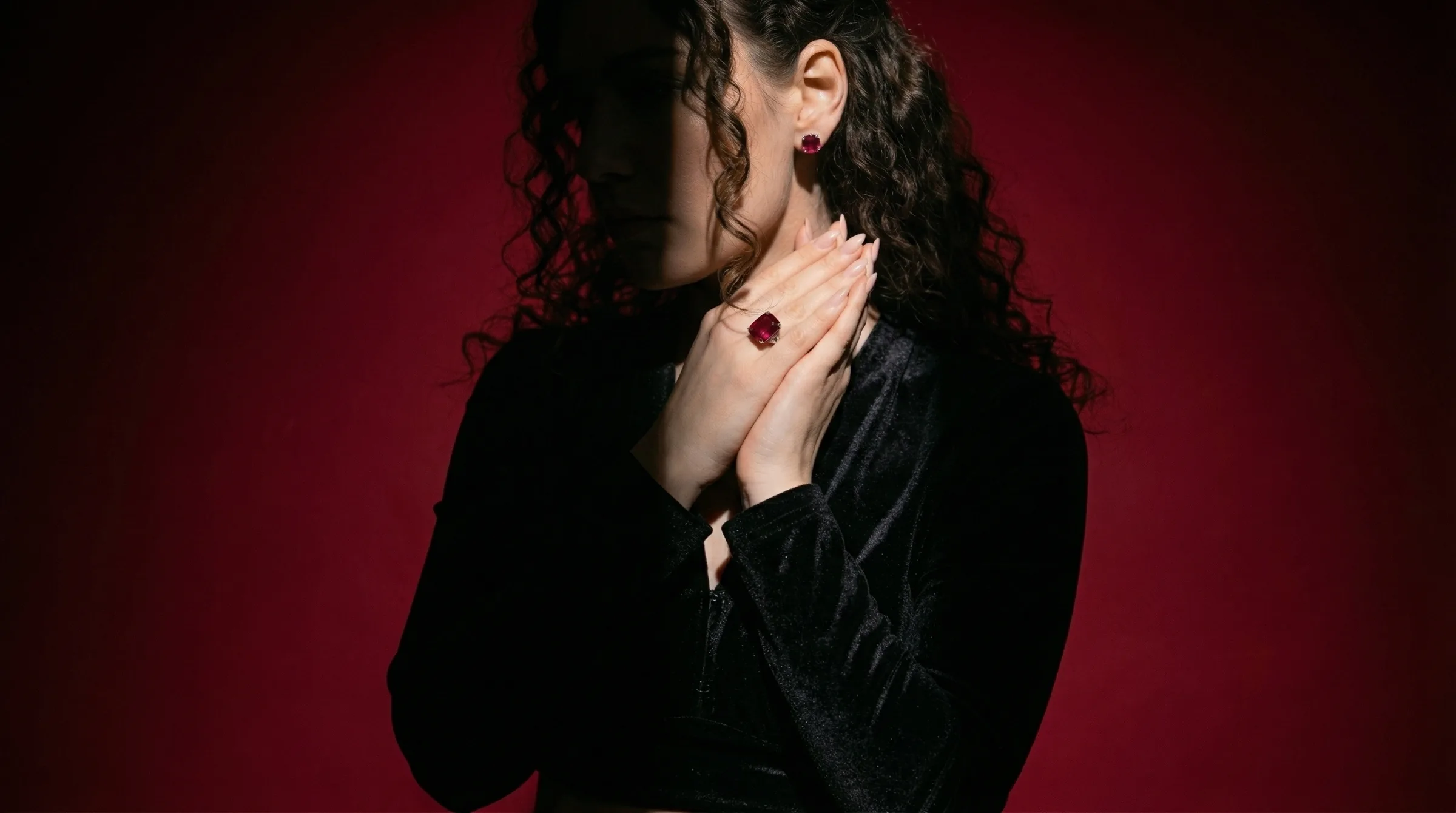
Flat lay is a poor fit for certain pieces. Chandelier earrings lose their movement when they're lying flat. Drop necklaces coil awkwardly. Anything that depends on drape — a long chain, a lariat, a tassel earring — often reads better on a model neck or a neck form. The overhead angle is the enemy of verticality.
For Amazon main images, flat lay on pure white (#FFFFFF or within RGB 247-255) is one of the formats that clears the pure-white background requirement while still looking considered. It's cleaner to execute than the ghost-mannequin approach for most small brands without a photography studio.
How to Shoot Flat Lay Manually
Here's the honest setup for a flat lay that competes with what you see from mid-size DTC brands.
Surface and background
Start with 20×30 inch (50×76cm) boards. White foamcore is the cheapest and most forgiving — it bounces light evenly and gives you a pure white background with no editing. For styled shots, a piece of 12×18 inch linen fabric laid over foamcore adds warmth without the wrinkle nightmare of a full fabric backdrop. Slate tiles from a tile shop (typically $4–8 each) are the correct surface for silver, grey, and steel pieces. Real marble is heavy and expensive; marble-effect vinyl contact paper over foamcore is indistinguishable at 48 megapixels.
Camera position
True flat lay requires the camera at exactly 90 degrees to the surface. On a tripod, that means an overhead arm or a tripod with the centre column inverted and tilted horizontal. If the camera is even 5 degrees off vertical, you get keystoning — straight edges appear to converge — and the surface stops looking flat. Level it with a bubble level on the hot shoe before you start.
For camera settings: f/8 to f/11 closes down enough to keep a full ring in focus across its depth without going so tight that diffraction softens the image. At ISO 100 and f/11, with a 60×90cm softbox at 45 degrees about 80cm from the surface, a shutter speed of 1/60s to 1/125s is typical. Shoot tethered if you can — the moment you see the image at full size on a monitor, small misfocus on a pavé setting becomes obvious.
Light setup
One large softbox, camera left, at 45 degrees to the surface. Add a white reflector card camera right at about 60cm from the surface edge to fill the shadow side. That's it. The mistake most people make is adding a second light opposite the first to eliminate shadows — you end up with flat, directionless light that kills texture. The shadow gives the piece dimension.
For gold pieces specifically: if the softbox is too close and output is too high, you'll blow out the specular highlight on any high-polish yellow gold. Pull the softbox back to 100–120cm from the surface and reduce output before adding a reflector.
Prop discipline
Three props maximum for any single shot. Usually one. A pearl bracelet on slate with a small sprig of white dried flowers reads clean. The same bracelet with the flowers, a linen swatch, a candle, and a seashell reads like a craft market table. Pick the one prop that frames the piece and supports the mood. Kill the rest.
Focus stacking for complex pieces
A wide diamond ring shot at f/11 from overhead will often have the near prongs tack sharp while the far prongs lose edge. Focus stacking — shooting 3–5 frames with the focus point moved slightly across the piece, then blending in Lightroom or Photoshop — gives you a result where every prong is sharp. It takes 10 minutes to learn and an extra 5 minutes per shot. For any piece with significant depth variation (tension settings, multi-row rings, large pendants with dimensional elements), it's worth the time.
How to Generate Flat Lay Styles with Hylo
Hylo's AI Photoshoot generates flat lay compositions without requiring any physical setup. Here's how to configure it for the main metal-and-surface combinations.
Brand Kit setup
Before generating anything, open your Brand Kit and set your primary metal. This isn't just metadata — Hylo uses it to calibrate surface tone in generated images. Set gold → warm surfaces; silver → cool surfaces; mixed metal → neutral. If your brand works across metals, set it to neutral and override per shoot.
AI Photoshoot settings for flat lay
In AI Photoshoot, select the flat lay style category. The modifier panel will surface options for:
- Surface: linen (gold/rose gold), slate (silver/platinum), white seamless (universal), marble (editorial, silver-forward), warm sand (editorial, gold-forward)
- Negative space: tight (35–45% empty), balanced (60–70% empty, the default), open (75–80% empty for minimalist brands)
- Props: none, botanical, textile accent, raw mineral
- Lighting mood: soft diffused (window-style), directional (45-degree softbox style), overhead fill (bright, even — closest to Amazon white background)
For a silver pavé eternity band targeting Etsy: Surface → slate, Negative space → balanced, Props → none, Lighting → soft diffused. Run 3–4 variations. The first pass usually gives you one usable image and two you'll want to retry — that's normal. Select the keeper, save it to Creative Library, and use AI Retouch if you need the background colour adjusted.
Iterating with the modifier panel
The modifier panel lets you adjust the flat lay config without starting a new brief. If the first-pass linen surface reads too warm for your gold chain, pull the surface warmth down in the modifier panel and regenerate. You're not re-uploading the product image — Hylo keeps it in the brief.
For brands shooting high volume: build a multi-product brief with your full SKU list and run all flat lay variations in a single session. The Creative Library organises the outputs by category, so you can pull the ring flat lays separately from the necklace flat lays when building a lookbook.
Examples Across Jewelry Categories
Rings
A 1ct round-cut diamond solitaire on white seamless, shot overhead with soft directional light and 65% negative space, reads cleanly at both full resolution and Etsy's 200×200 search thumbnail. The overhead angle shows the stone table, the prongs, and the band profile clearly. For a thick signet ring or a wide-band statement ring, add a very slight offset from true 90 degrees — perhaps 5 degrees — to show the side profile without losing the flatlay feel.
Necklaces
Delicate chains need to be arranged deliberately before shooting. A 16-inch 14k gold vermeil chain coiled in a casual oval with the pendant centred reads more intentional than a chain spread fully across the frame. For pearl strand necklaces, a slight S-curve arrangement on linen is the standard editorial approach — it implies softness and movement without requiring the piece to be worn.
Earrings
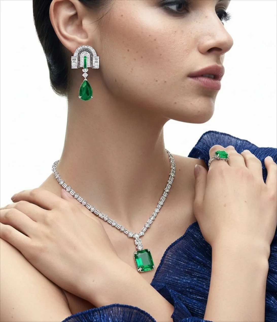
Pairs, not singles. Shoot both earrings together, styled symmetrically or in a slight offset arrangement. Huggie earrings photograph well flat. Long drop earrings often don't — consider photographing them hung from a thin acrylic display strip that you'll remove in post, rather than lying flat.
Bracelets
A tennis bracelet styled in a loose S-curve on white seamless is the correct flat lay format for marketplace listings. Bangles look best stacked — three bangles of related metals on slate at 65% negative space is a proven Pinterest composition. Charm bracelets are the exception: the flat lay angle often loses the dimensionality of the charms, and a lifestyle shot on a wrist may be more effective.
Brooches and pins
Flat lay is the best format for brooches — they're designed to be seen from the front. A Victorian-style brooch on aged velvet with 60% negative space against a warm cream card stock is the kind of image that gets repinned.
Common Flat Lay Mistakes
Wrong surface for the metal
This is the one that causes the most post-processing grief. A warm linen surface under a silver piece will shift the white balance of the whole shot toward amber. Your editing software will try to correct it and overcorrect the silver toward blue. Shoot silver on cool neutrals from the start.
Filling the frame
The impulse to show the piece as large as possible is understandable but wrong for flat lay. A ring at the centre of a tight crop looks like a product shot, not a flat lay. Give it room. The negative space is doing work — it's signaling a certain level of brand seriousness that buyers respond to. Most of the flat lays that convert well on Pinterest are 65–70% empty.
Too many props
Four props competing for attention means the eye has no clear entry point. The piece gets lost. One prop, deliberately placed, frames the piece. Two can work if they're in the background and clearly subordinate. Three is almost always too many.
Lighting directly overhead
An overhead light directly above the piece produces an even wash that flattens every surface it touches. The linen looks like paper. The gold looks like paint. Bring the light to 45 degrees. The shadow it creates on the linen or slate is what gives the image depth.
Ignoring the crop
If the image is going to Etsy, it will be cropped square. If it's going to Amazon, the primary image must have a pure white background. If it's going to Instagram, it may be viewed as a tall 4:5 crop in the feed. Shoot with these crops in mind. A flat lay composed for a wide landscape ratio with the piece in the horizontal centre will look wrong as a 4:5 portrait crop — the piece ends up at the top of the frame with dead space below.